SWBC
Where Vision Meets Usability: A Digital Revival
Where Vision Meets Usability: A Digital Revival
Client.
KCM
Tools.
Figma
Year.
2022 - open
Role.
UI Designer
Context
The Southwest Believers’ Convention is an annual event that attracts thousands of Christian believers from around the globe for a week filled with powerful teaching, worship, and connection.
The Southwest Believers’ Convention is an annual event that attracts thousands of Christian believers from around the globe for a week filled with powerful teaching, worship, and connection.
The Southwest Believers’ Convention is an annual event that attracts thousands of Christian believers from around the globe for a week filled with powerful teaching, worship, and connection.
The Challenge
The convention needed a modern homepage that would inspire confidence, clearly communicate key event details, and make it easy for people to get involved. The old homepage was outdated and cluttered. Important information, such as the schedule and speakers, was buried, and the site was not responsive for optimal viewing from devices like phones and tablets.
I wanted to create a homepage that would feel bold and inviting while handling a wide range of content. From daily schedules and speaker bios to ministry spotlights and volunteer sign-ups. It also had to work seamlessly across devices and connect with a broad audience.
Key Focus Areas
First Impression: A bold hero section sets the tone with the event logo, city imagery.
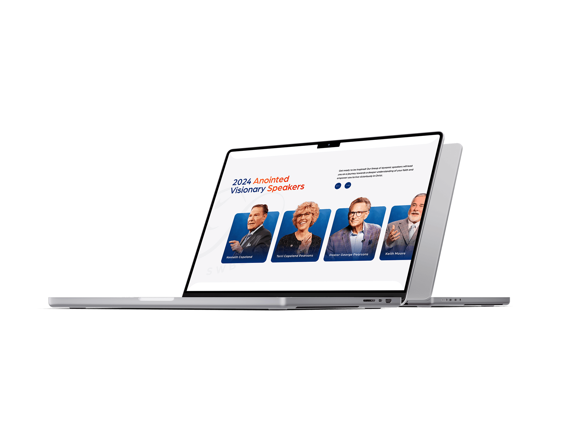
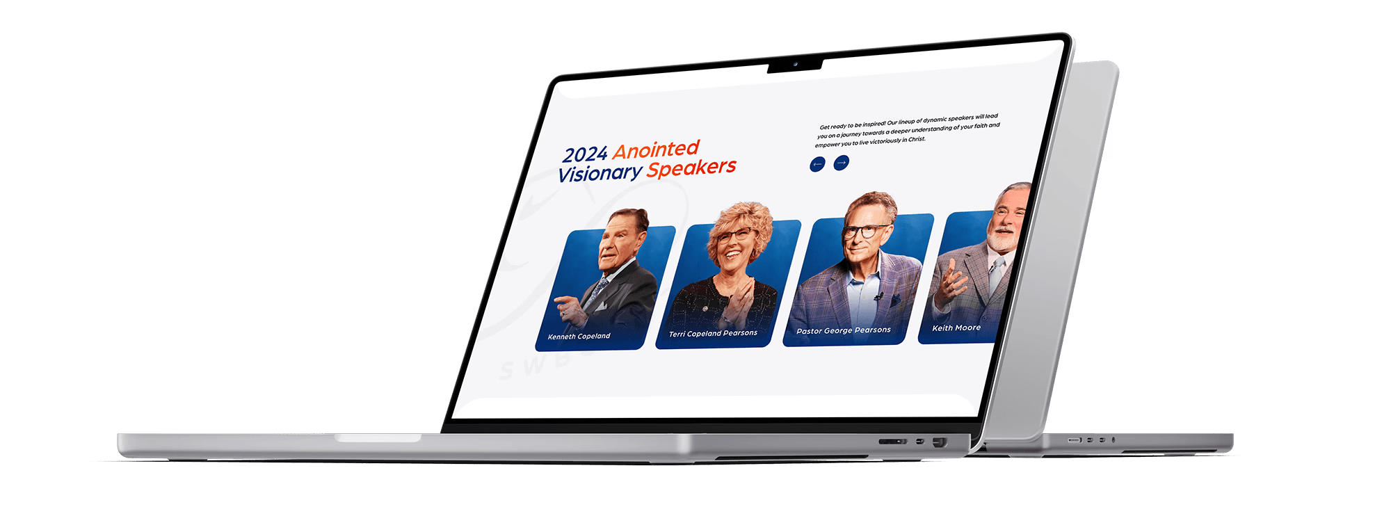
Showcasing the Speakers: A dedicated section introduces the featured speakers in a clean, scannable layout to build anticipation.
Simplifying the Schedule: A mobile-friendly daily agenda that lets users explore what’s happening each day with ease.
Featured Groups: Group and ministry tiles help visitors connect with where they belong, whether they’re a parent, youth, or volunteer.
Encouraging Action: Purposeful calls-to-action throughout the website led visitors to register, explore more, or sign up to serve.
The convention needed a modern homepage that would inspire confidence, clearly communicate key event details, and make it easy for people to get involved. The old homepage was outdated and cluttered. Important information, such as the schedule and speakers, was buried, and the site was not responsive for optimal viewing from devices like phones and tablets.
I wanted to create a homepage that would feel bold and inviting while handling a wide range of content. From daily schedules and speaker bios to ministry spotlights and volunteer sign-ups. It also had to work seamlessly across devices and connect with a broad audience.
Key Focus Areas
First Impression: A bold hero section sets the tone with the event logo, city imagery.
Showcasing the Speakers: A dedicated section introduces the featured speakers in a clean, scannable layout to build anticipation.
Simplifying the Schedule: A mobile-friendly daily agenda that lets users explore what’s happening each day with ease.
Featured Groups: Group and ministry tiles help visitors connect with where they belong, whether they’re a parent, youth, or volunteer.
Encouraging Action: Purposeful calls-to-action throughout the website led visitors to register, explore more, or sign up to serve.
My Approach
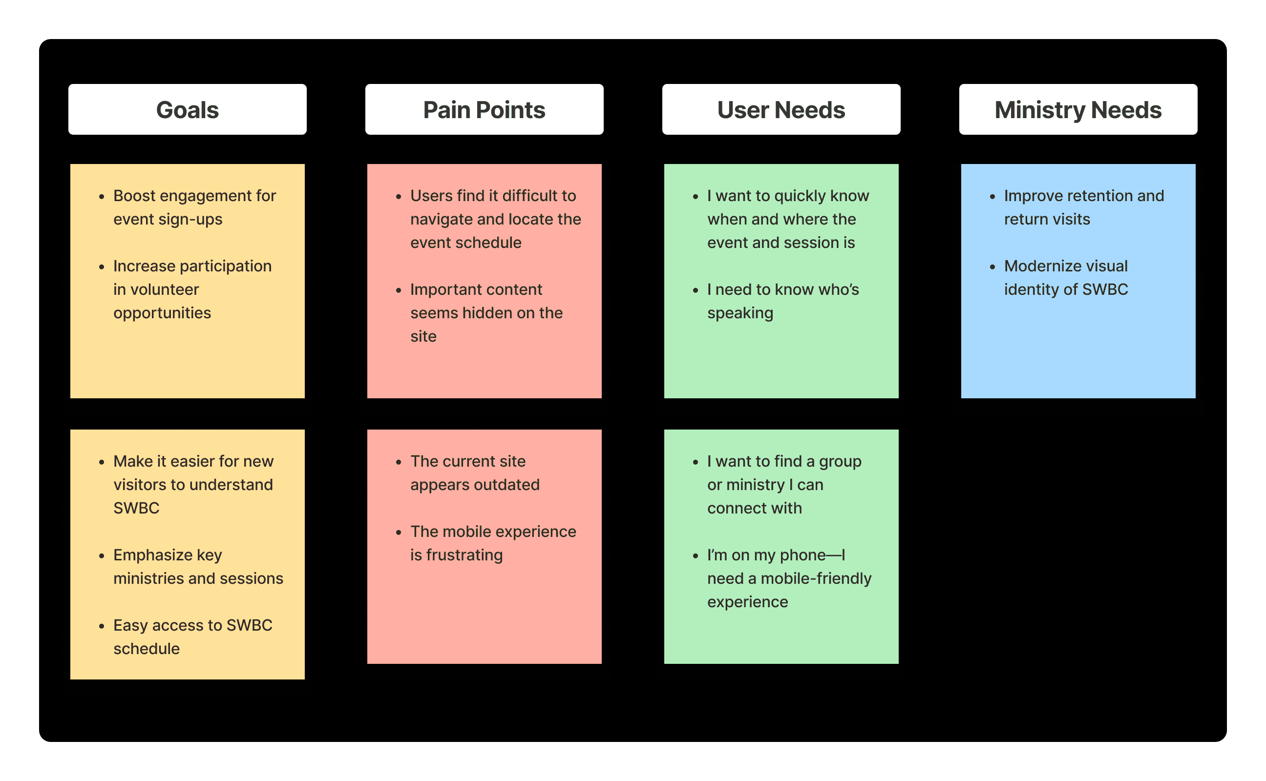
I focused on identifying the specific needs, pain points, and motivations of SWBC's diverse audience. My goal was to ensure that the homepage effectively addressed both first-time visitors and long-time attendees.
I collaborated with various departments, including Event Planning, Ministries, and Outreach, to gain a deeper understanding of their objectives, content requirements, and definitions of success for the homepage.
I analyzed historical website data to identify high-traffic pages and points where users tended to drop off. I additionally conducted surveys to gather feedback from users about their most important needs upon landing on the homepage.
I examined the digital presence of other large-scale conventions and faith-based events to identify effective content strategies, layout patterns, and engagement techniques that we could adapt for SWBC.
Color Theme
The visual system is designed to be inspiring. Clean layouts and ample white space allow content to shine. Warm accent colors, such as orange and red, highlight key actions, adding energy. Sans serif typography and uplifting imagery foster a sense of purpose. These design choices create an open, engaging digital experience that aligns with the event’s mission.
The visual system is designed to be inspiring. Clean layouts and ample white space allow content to shine. Warm accent colors, such as orange and red, highlight key actions, adding energy. Sans serif typography and uplifting imagery foster a sense of purpose. These design choices create an open, engaging digital experience that aligns with the event’s mission.
The visual system is designed to be inspiring. Clean layouts and ample white space allow content to shine. Warm accent colors, such as orange and red, highlight key actions, adding energy. Sans serif typography and uplifting imagery foster a sense of purpose. These design choices create an open, engaging digital experience that aligns with the event’s mission.

Impact
The redesigned homepage enhanced user engagement. By presenting information in a clear and inviting layout, users could easily find what they needed. Whether it was registering, exploring the schedule, learning about ministries, or signing up to volunteer.
A seamless experience was created across all devices, ensuring that every visitor, ranging from long-time attendees to first-timers, felt connected, informed, and ready to participate.


