Project Millstone
Project Millstone
A New Digital Space.
A New Digital Space.
Client.
Eagle Mountain Church
Tools.
Figma
Year.
2025
Role.
UI/UX Designer & Developer
Context
Millstone is a new initiative launched by Eagle Mountain International Church (EMIC) aimed at helping families protect and guide their children online while remaining grounded in their faith. It’s more than just a website; it serves as a digital home for parents, teens, and educators seeking tools, support, and truth in a world that can often feel confusing and overwhelming.
This project was not a redesign, but rather a ground-up development, and I was honored to contribute to shaping both the user experience and the emotional tone of the site.
The Challenge
In today’s digital age, families are more connected than ever, but that doesn’t always mean they’re better supported. There was a growing, undeniable gap: parents, teachers, and caregivers simply couldn’t find one safe, trusted space online where kids and teens could learn, grow, and explore with confidence. Instead, they found themselves piecing together content from scattered apps, YouTube channels, and tools, many of which lacked the safety, substance, or values they were hoping for.
I heard recurring concerns:
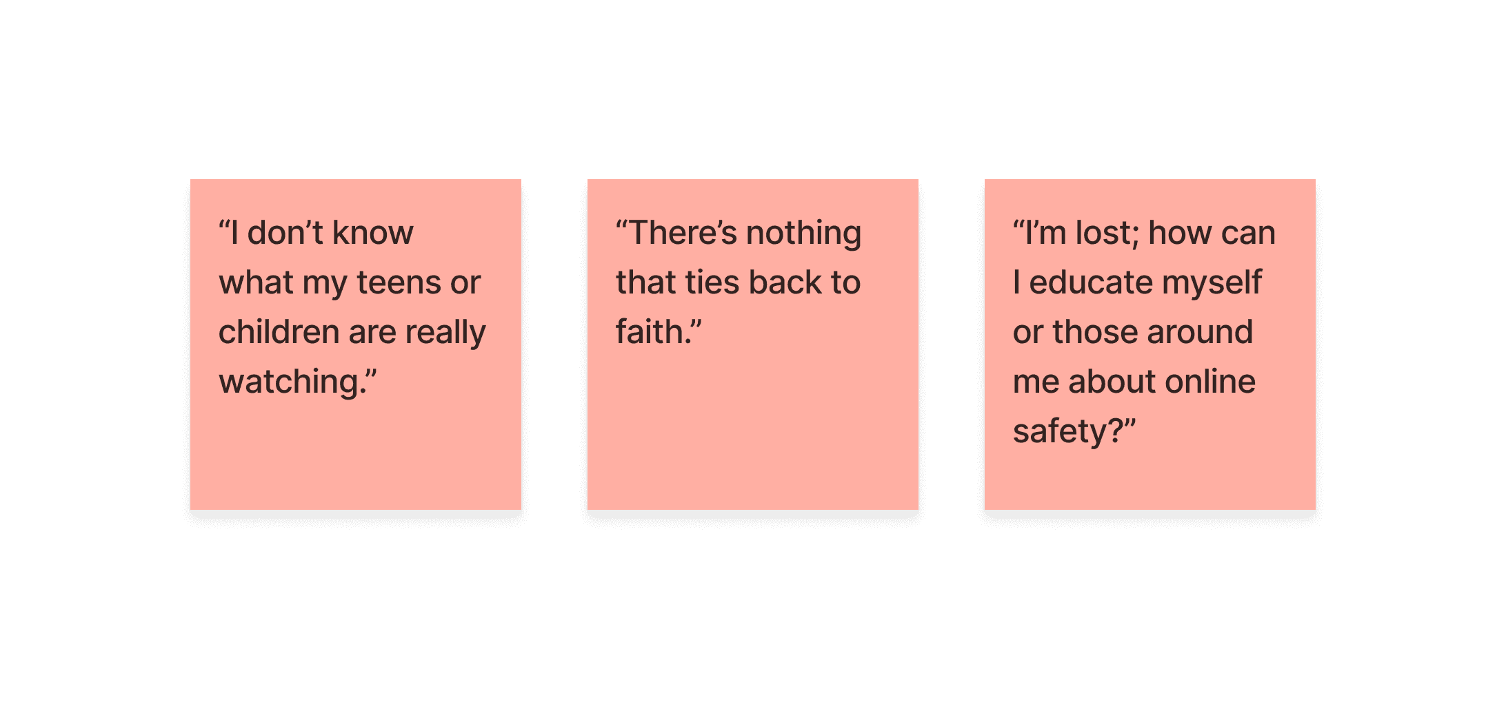
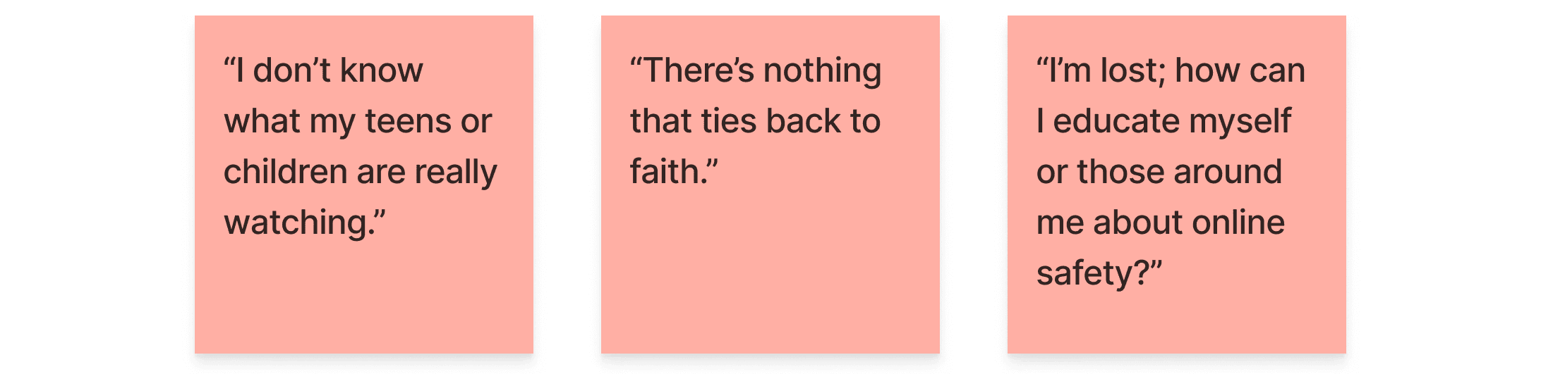
What was missing was more than just a website. It was a space that combined engagement and safety, values and relevance, learning and connection.
Key Focus Areas
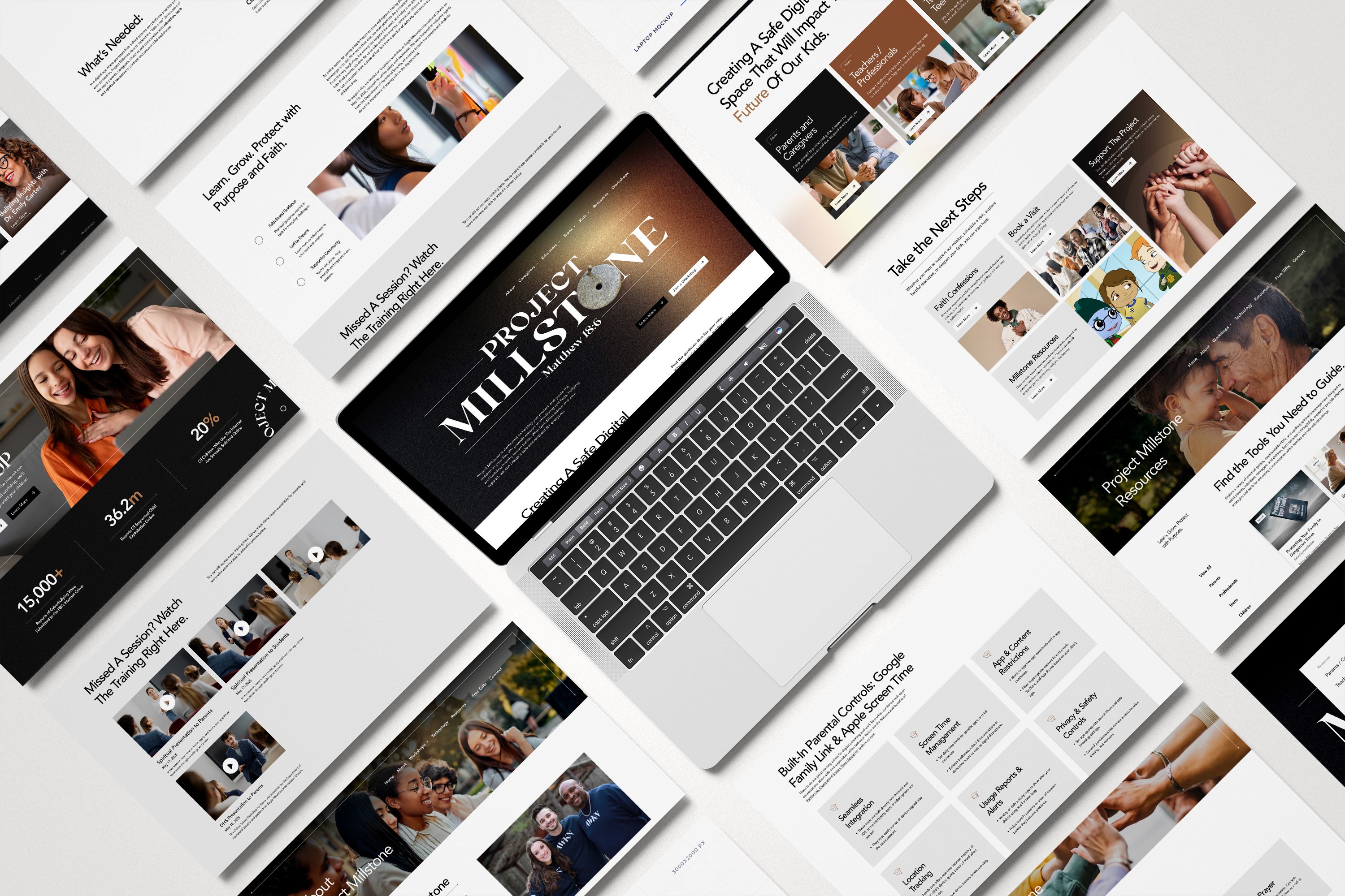
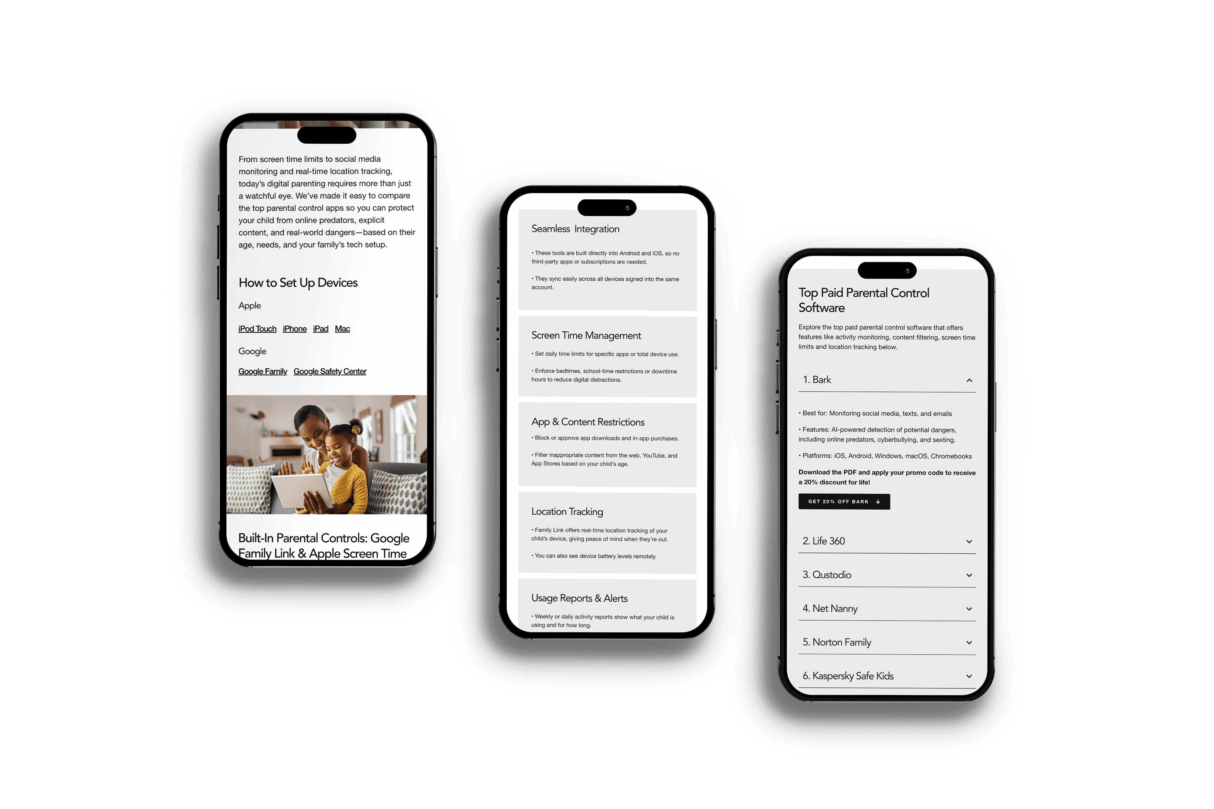
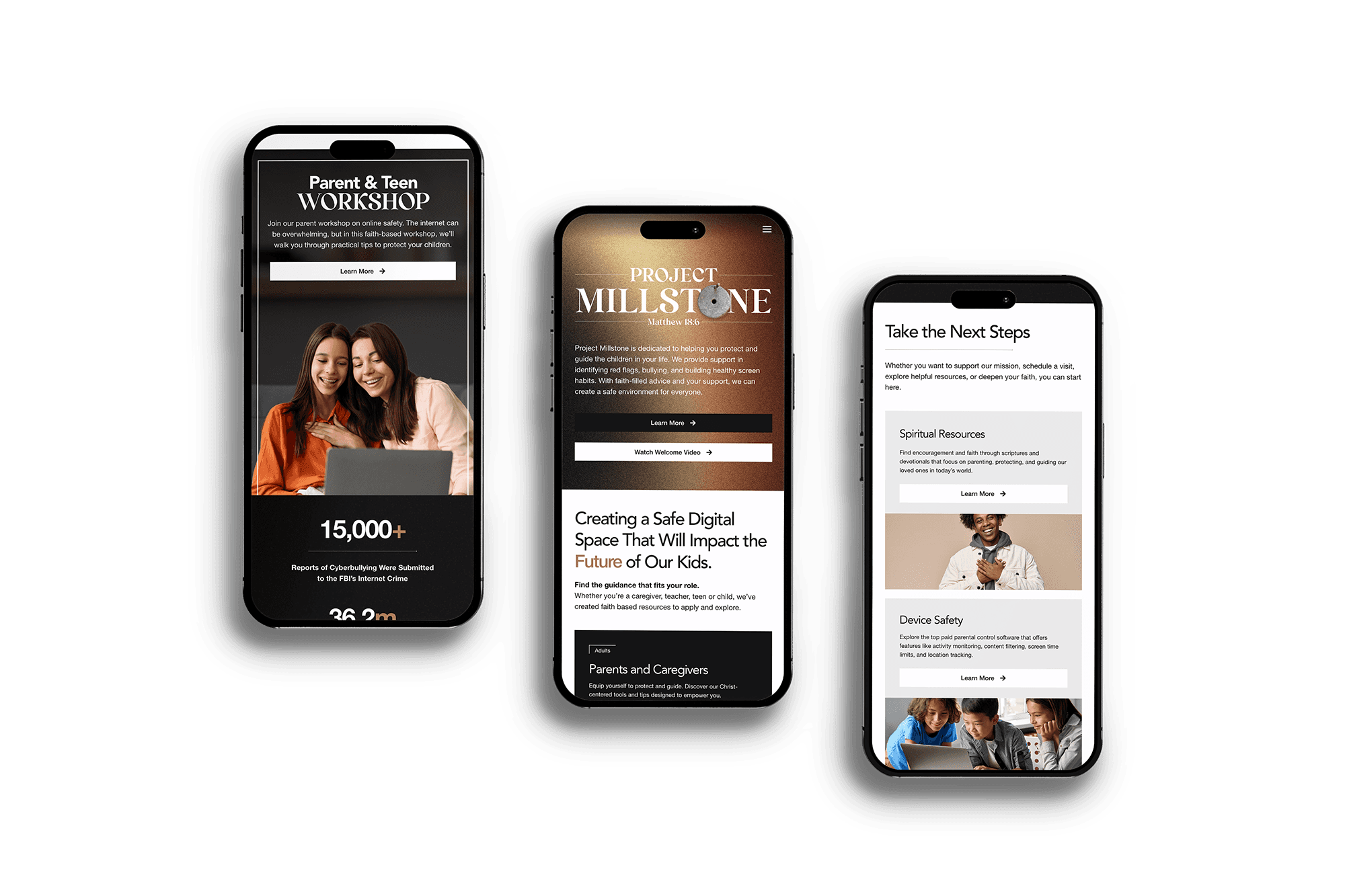
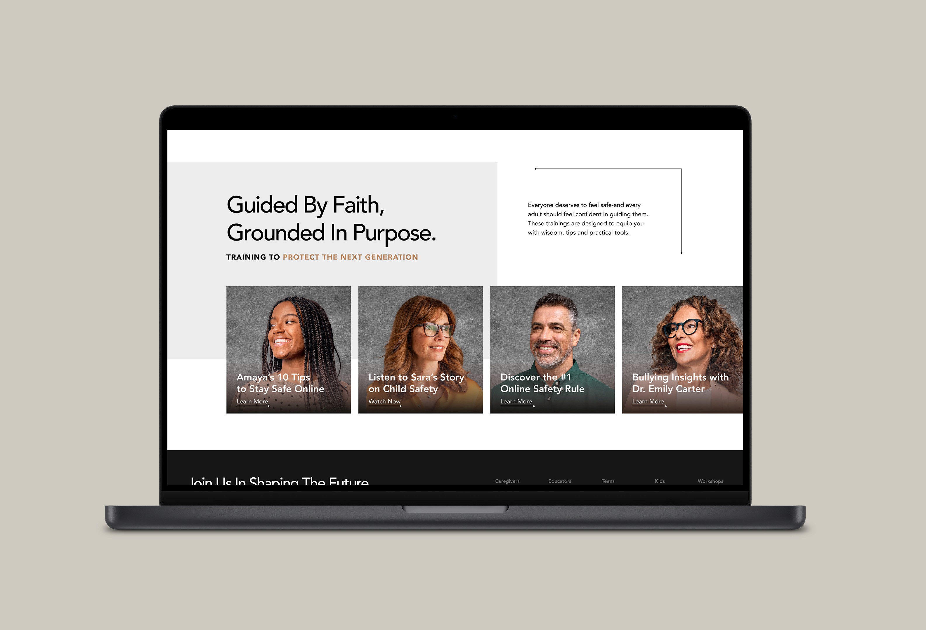
A Safe Digital Environment: Providing a platform that offers children, teenagers, parents, and educators access to information and activities about online safety.
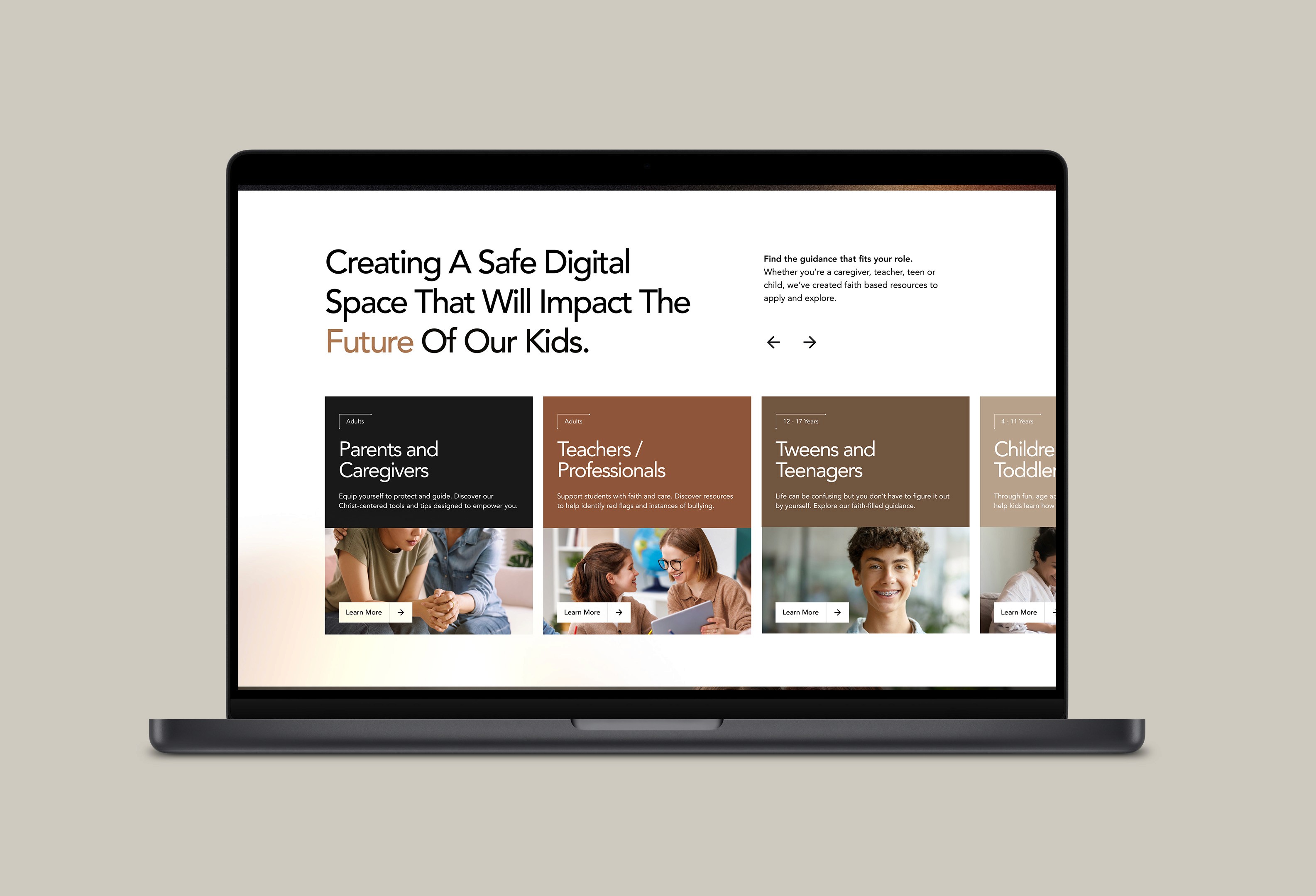
Audience-Specific Pathways: Ensuring a clear user experience for parents and caregivers, teachers and professionals, as well as children and teenagers, to easily access specific content.
Fostering Community & Engagement: Encouraging participation in workshops and small groups.
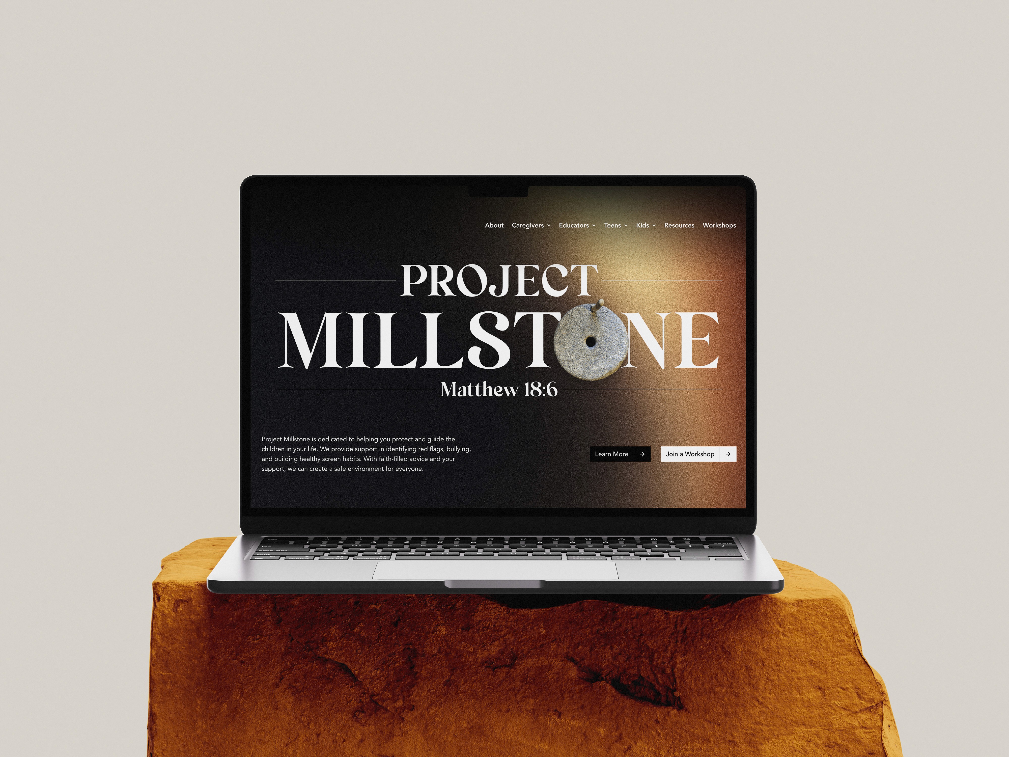
Purposeful Brand: Designing a visual and interactive experience that reflects the project's serious mission and modernism.
What was missing was more than just a website. It was a space that combined engagement and safety, values and relevance, learning and connection.
Key Focus Areas
A Safe Digital Environment: Providing a platform that offers children, teenagers, parents, and educators access to information and activities about online safety.
Audience-Specific Pathways: Ensuring a clear user experience for parents and caregivers, teachers and professionals, as well as children and teenagers, to easily access specific content.
Fostering Community & Engagement: Encouraging participation in workshops and small groups.
Purposeful Brand: Designing a visual and interactive experience that reflects the project's serious mission and modernism.
What was missing was more than just a website. It was a space that combined engagement and safety, values and relevance, learning and connection.
No Centralized Hub
Families were forced to hop between platforms—none of which were built with holistic growth in mind.
No Real Concerns About Online Safety
Without reliable moderation or parental oversight, existing tools often left kids vulnerable to inappropriate content and unchecked interactions.d.
Lack of Quality
Educators and parents struggled to find age-appropriate, engaging content that also aligned with emotional, spiritual, or developmental goals.
My Approach
To build something truly impactful, I started by looking outward. I conducted a competitive analysis of existing educational tools, faith-based platforms, and social apps studying what worked, what didn’t, and where real families were being left behind.
The research quickly revealed a few key insights:
There was a need for curated content. Something safe, intentional, and engaging.
Parents and educators wanted clear age filters, while kids needed content that spoke to them, not just at them.
It also became clear that one size fits all wouldn't work. We needed to create distinct but connected experiences: One for parents and teachers to guide, manage, and feel empowered. Another for kids and teens to explore, learn, and grow at their own pace.
These findings helped shape the platform’s structure, tone, and priorities from the very beginning.
Color Scheme
The visual system is designed to be inspiring. Clean layouts and ample white space allow content to shine.
The visual system is designed to be inspiring. Clean layouts and ample white space allow content to shine.
Impact
The interface boosts user engagement and optimizes resource utilization. The site provides intuitive navigation and clearly presented content, enhancing accessibility and promoting participation in programs and workshops. It acts as a valuable tool for learning about safe digital practices.
The interface boosts user engagement and optimizes resource utilization. The site provides intuitive navigation and clearly presented content, enhancing accessibility and promoting participation in programs and workshops. It acts as a valuable tool for learning about safe digital practices.